Container Queries Finally Make Component-Driven CSS Make Sense
Here's a scenario I've hit at least a dozen times.
You build a card component. It has an image, a title, some metadata. Looks great. You use it in a sidebar now it's cramped and the image layout breaks. You add a media query to the card. Now the card breaks somewhere else because the media query fires based on viewport width, not the card's actual container width.
You end up with something like:
css/* This is layout logic scattered across multiple files */
@media (max-width: 768px) {
  .card { flex-direction: column; }
}

.sidebar .card { flex-direction: column; }
.product-grid .card { /* different override */ }
The component doesn't own its own responsive behavior. The parent does. Or the grandparent. It's a mess.
Container queries exist to fix this, and as of late 2023 they have solid enough browser support that I'm using them in production without a fallback.
The Concept in One Paragraph
A container query lets an element respond to the size of its parent container rather than the viewport. You mark an element as a container, and its descendants can write queries against it. The card component can say "when my container is less than 400px wide, go single-column" and that rule holds wherever the card appears, regardless of viewport size.
Basic Syntax
css/* Mark the wrapper as a container */
.card-wrapper {
  container-type: inline-size;
  container-name: card; /* optional but useful */
}

/* Style the card based on the container's width */
@container card (min-width: 400px) {
  .card {
    display: grid;
    grid-template-columns: 200px 1fr;
  }

  .card__image {
    aspect-ratio: 1;
  }
}

@container card (max-width: 399px) {
  .card {
    display: flex;
    flex-direction: column;
  }

  .card__image {
    aspect-ratio: 16/9;
    width: 100%;
  }
}
Now this card works in a sidebar, a main grid, a modal anywhere. The layout decision lives inside the component.
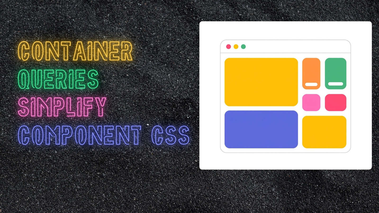
A Real Example: The Dashboard Widget
Here's where this gets genuinely useful. Dashboard widgets need to work at multiple sizes because dashboards are configurable. With media queries, this is a nightmare. With container queries:
css.widget {
  container-type: inline-size;
  container-name: widget;
}

/* Compact: just the number and label */
.widget__body {
  display: flex;
  flex-direction: column;
  align-items: center;
  padding: 1rem;
}

.widget__chart {
  display: none;
}

.widget__trend {
  display: none;
}

/* Medium: add the trend indicator */
@container widget (min-width: 250px) {
  .widget__trend {
    display: flex;
    gap: 0.25rem;
    align-items: center;
  }
}

/* Large: show the sparkline chart */
@container widget (min-width: 400px) {
  .widget__body {
    display: grid;
    grid-template-columns: 1fr auto;
    align-items: start;
  }

  .widget__chart {
    display: block;
    width: 120px;
    height: 60px;
  }
}

/* Extra large: full chart with labels */
@container widget (min-width: 600px) {
  .widget__chart {
    width: 200px;
    height: 100px;
  }

  .widget__chart-labels {
    display: flex;
    justify-content: space-between;
  }
}
One component, four visual states, zero knowledge of where it's being placed.
In React/CSS Modules
Container queries slot into component-based architectures naturally:
tsx// Widget.tsx
import styles from './Widget.module.css'

interface WidgetProps {
  title: string
  value: string | number
  trend?: number
  chartData?: number[]
}

export function Widget({ title, value, trend, chartData }: WidgetProps) {
  return (
    <div className={styles.widget}>
      <div className={styles.body}>
        <div className={styles.header}>
          <span className={styles.title}>{title}</span>
          {trend !== undefined && (
            <span
              className={`${styles.trend} ${trend >= 0 ? styles.up : styles.down}`}
            >
              {trend >= 0 ? '↑' : '↓'} {Math.abs(trend)}%
            </span>
          )}
        </div>

        <span className={styles.value}>{value}</span>

        {chartData && (
          <div className={styles.chart}>
            <Sparkline data={chartData} />
          </div>
        )}
      </div>
    </div>
  )
}
css/* Widget.module.css */
.widget {
  container-type: inline-size;
  container-name: widget;
}

.body {
  padding: 1rem;
}

.trend {
  display: none;
}

.chart {
  display: none;
}

@container widget (min-width: 250px) {
  .trend {
    display: inline-flex;
  }
}

@container widget (min-width: 400px) {
  .body {
    display: grid;
    grid-template-columns: 1fr auto;
    gap: 0.5rem;
  }

  .chart {
    display: block;
  }
}
The component renders the same JSX at every size. CSS handles the presentation. This is what "separation of concerns" actually looks like.
Style Queries (The Next Level)
Browser support is still catching up here, but style queries let you query CSS custom property values on the container not just dimensions.
css/* Parent sets a property */
.card-wrapper {
  container-type: style;
  --card-variant: featured;
}

/* Child queries it */
@container style(--card-variant: featured) {
  .card {
    border: 2px solid var(--color-accent);
    background: var(--color-accent-subtle);
  }

  .card__badge {
    display: block;
  }
}
This is a typed, CSS-native way to pass "props" from parent to child without JavaScript. It's niche but when the use case fits, it's elegant.
The Gotcha: Container Queries and the Container Itself
A container cannot respond to itself. The container's size is set by its own layout context (its parent, its intrinsic size, etc.). Only its descendants can query against it.
This means your structure needs one extra wrapper in some cases:
html<!-- This doesn't work: .card can't query itself -->
<div class="card" style="container-type: inline-size">
  <!-- Can use container query here -->
</div>

<!-- Do this instead -->
<div class="card-container" style="container-type: inline-size">
  <div class="card">
    <!-- .card can now query .card-container -->
  </div>
</div>
It's a minor annoyance but once you know it, you don't hit it twice.
When to Still Use Media Queries
Container queries don't replace media queries entirely. Use media queries for:
- Page-level layout — the number of columns in your main grid, the sidebar being visible or hidden. These are viewport decisions.
- Typography scale — base font size relative to viewport still makes sense at the document level.
- Print styles —
@media printis still the right tool.
Container queries are for components. Media queries are for layouts. Both together, and your CSS starts to make structural sense in a way it hasn't since responsive design became a thing.
Browser Support Today
container-type: inline-size is supported in Chrome 105+, Firefox 110+, Safari 16+. That's essentially everything modern. If you need IE11 support, you have bigger problems than container queries.
The style queries feature is still behind flags in most browsers, so I'd hold off on that in production for now.
I've been using container queries in new projects for about six months and I've stopped writing parent-scoped overrides almost entirely. The DX improvement is real.